

Top Serif Fonts You Need Right Now

Hey, hey! I’m so glad you’re here! joined me on the L. Rae Design Blog. Before you do anything, bookmark www.lraedesign.com/blog so you can stay up-to-date on future L. Rae Design font collections, L. Rae Design freebies, templates, tutorials and SO much more.
If you’re anything like me, you spend HOURS pouring over typefaces and fonts, dissecting weights, styles, and ALL the beautifully TINY details that make each one so unique. Well, pour no more (at least for today) because I’ve released the first L. Rae Design collection featuring my top font picks for the month.
Additionally, I’m hoping these monthly collections will help you wade through the millions of fonts out there and shine a bright spotlight on the artists, typographers and their work.
Last minute reminder
Finally, don’t forget that you can share the graphics in this post on Pinterest by hovering over the graphic of your choice and clicking Pin, you can share the blog link to any social channel, and lastly, you can tag the designers or studios if you’re featuring their fonts in your work on channels like Facebook or Instagram.
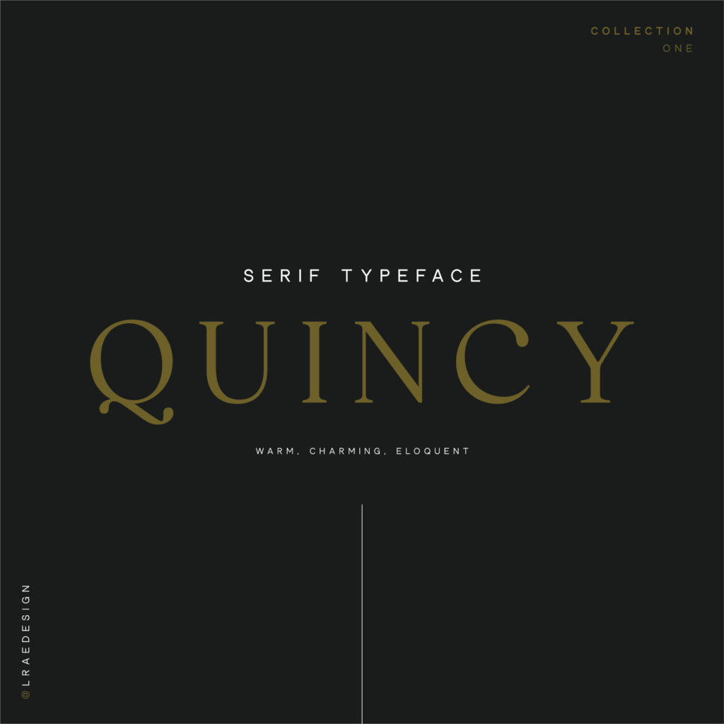
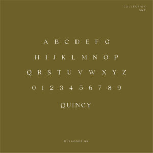
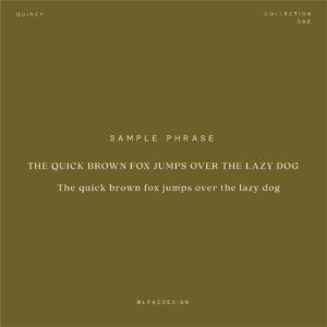
01. Quincy by Connary Fagen, Inc.
02. London by JenWagnerCo
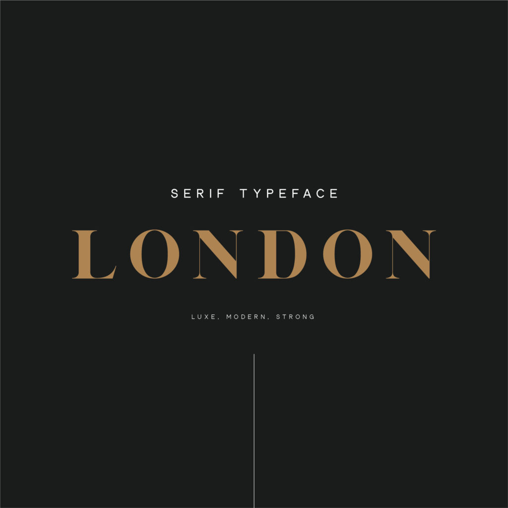

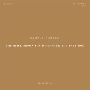
London is sleek, modern, and LUXE. It’s gorgeously clean and catches the eye the minute you see it on screen or in print. It’s the font you want in your collection if you’re looking to stand out from the crowd.
03. Avalanche by New Tropical Design

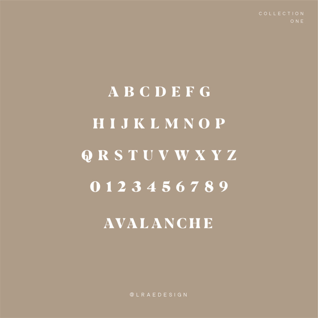

You’ll quickly see that Avalanche is vintage-inspired and exudes all sorts of 70’s vibes. It doesn’t fall flat. It has just enough curve and energy without coming off as trite. It’s clean, versatile, and very stylish. I think it would be perfect for labels, any sort of large, bold print or social media graphics and quotes. Depending on what you’re using Avalanche for, it can pull both masculine or feminine.
04. Bodoni by Morris Benton and Giambattista Bodoni
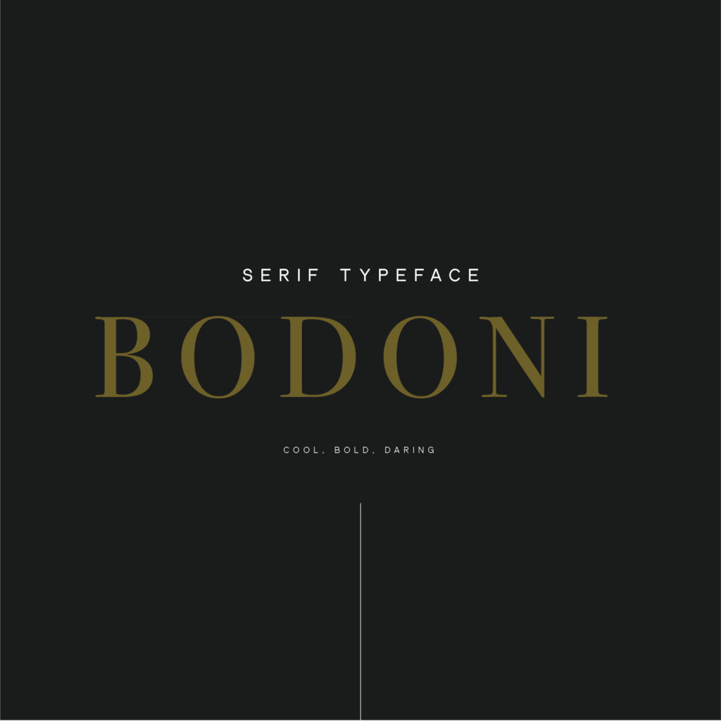


Bodoni may be old-school but it truly is a classic choice. It’s strong. It’s daring. It reminds me of a bold red lip or a glass of rich Cabernet. It’s the perfect choice.
05. Manhattan by Jen Wagner Co.
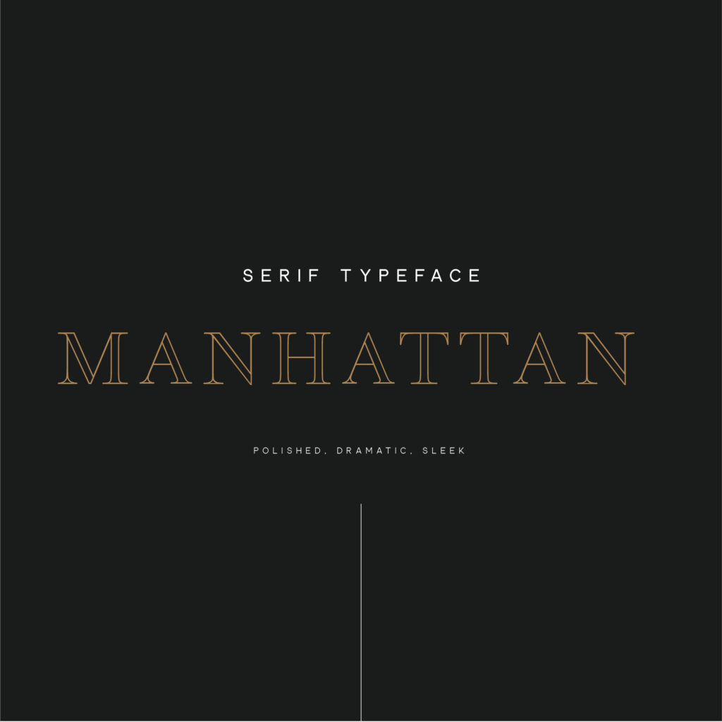

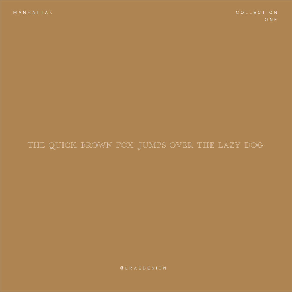
Manhattan, Manhattan, Manhattan. First things, first, it’s drop dead gorgeous. Manhattan is polished, dramatic, and sleek. It’s luxurious and light without arrogance. This is one of my all-time faves. Jen suggests it as a logo, or headline and I couldn’t agree more.
06. Sundays by New Tropical Design
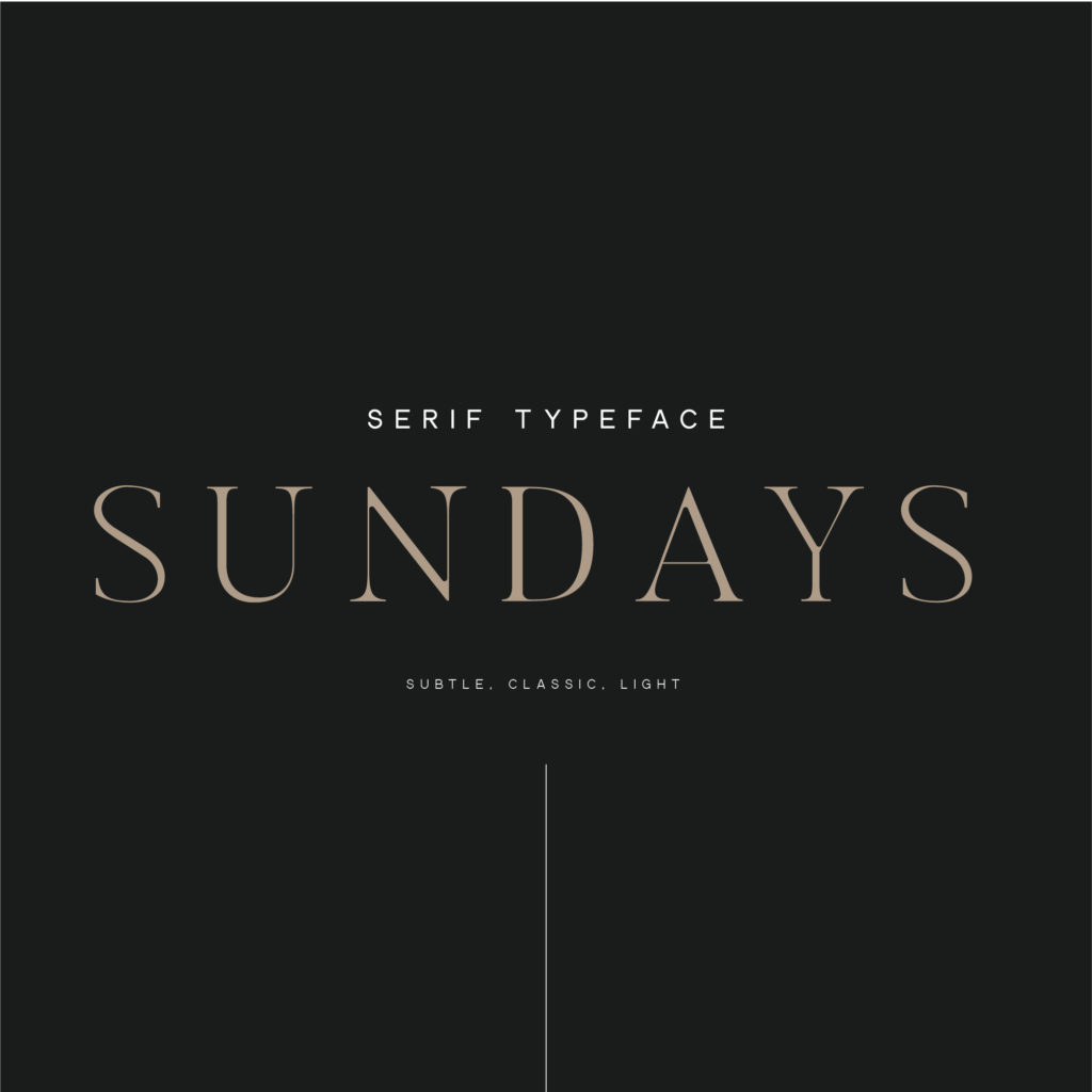

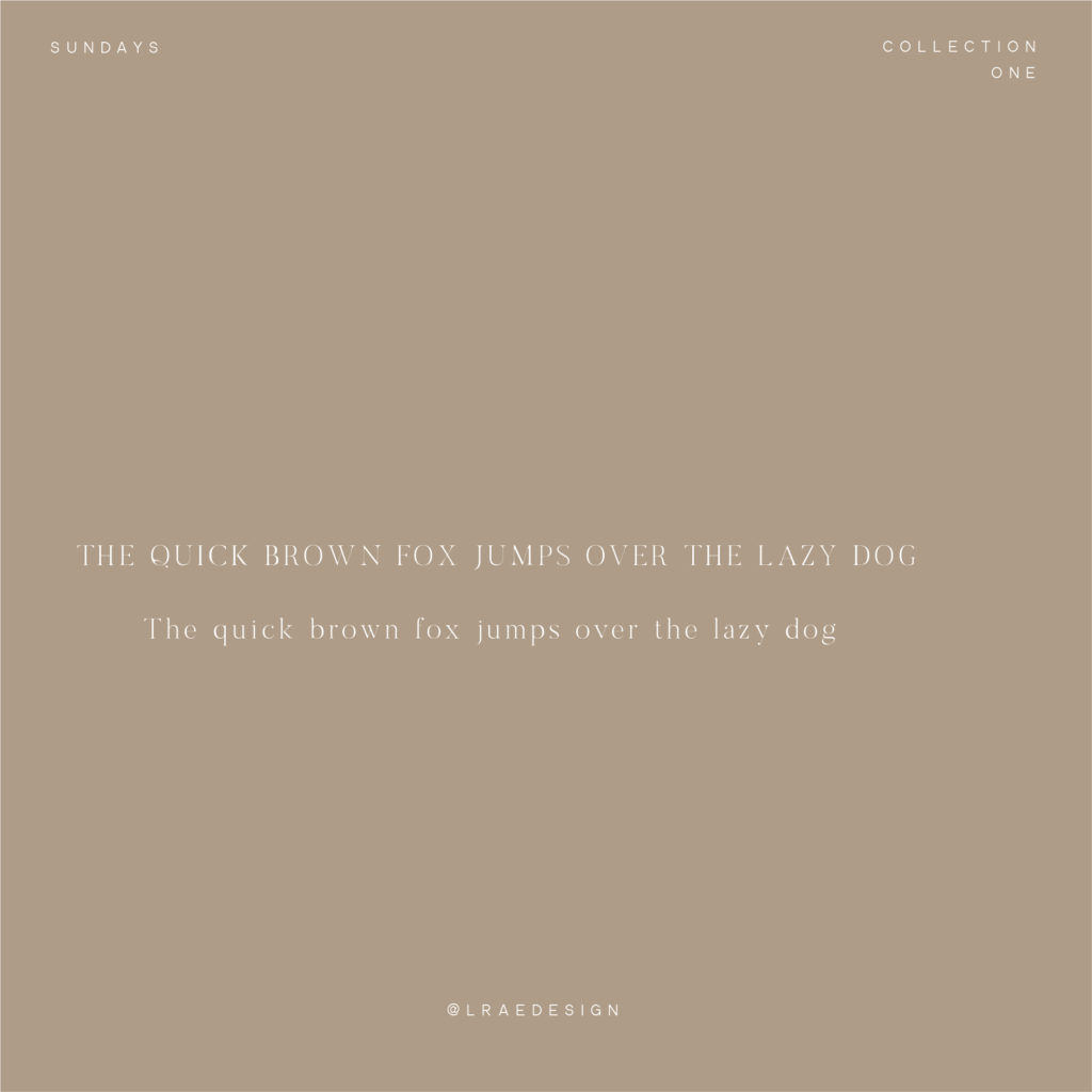
“Easy like Sunday morning…” is what comes to mind when I look at Sundays. It’s subtle, open with timeless touches. It’s light. Sunday is the perfect font to give you a relaxed feel while still feeling professional and put together.
Looking to up your social media game? Share these graphics, or any graphics from these blog posts (and don’t forget to tag @lraedesign):
Top 5 Branding Tips to Help You Achieve Ultimate Branding Success


